Bedburg is a small, quaint town nestled in the countryside to the south-west of Cologne. Best known for it’s modest castle and the infamous ‘Werewolf of Bedburg” –it is currently undergoing a transformation, with tech giants such as Microsoft and Samsung building offices in the area and bringing with them an infux of professionals and young families looking for a home in the countryside which also provides all the modern conveniences one could desire.
With this in mind, Bedburg Erftaue was born – a complex of housing developments, shopping districts, education, public amenities, sustainable transport solutions and entertainment. A place where everything you need is right on your doorstep.
A branding solution was developed which draws on the history and greenery of the area and invites sustainability-conscious and discening buyers to find their home within.
LOGO & LOCKUP
The brief for Bedburg requested that the brand and visuals draw on the abundant greenery and rich history of the area, and combine this with themes of sustainable living and family. The logo, colour palette and strapline were developed to be calming, inviting, and importantly – not reflective of any current trends that would cause the branding to age over what will hopefully be a decades-long lifespan.
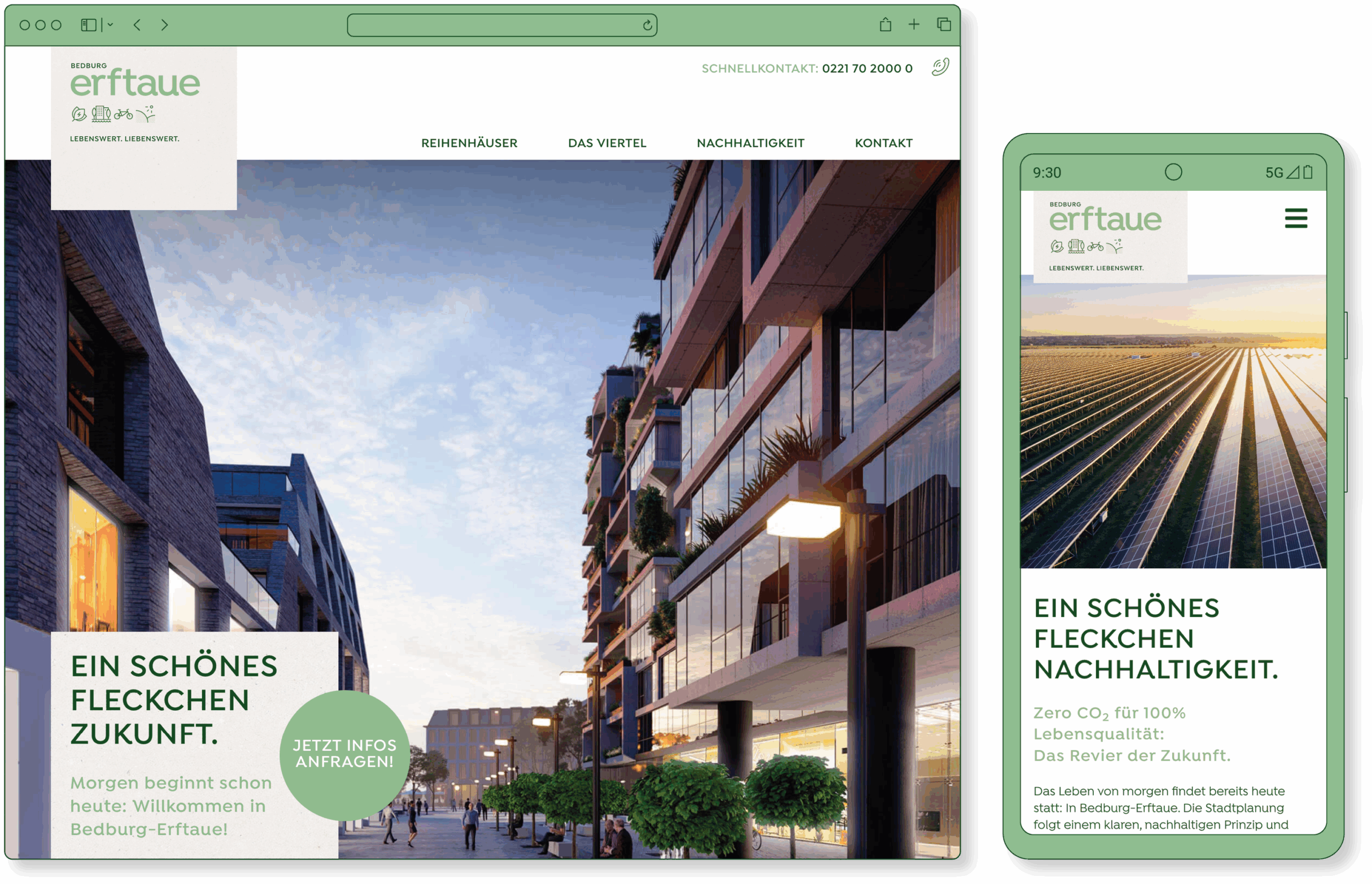
WEBSITE
The Bedburg Erftaue website serves a dual purpose in attracting both home-makers and developers to the area. Despite being heavy on technical information, the inviting, natural branding serves to keep the site appealing.
To illustrate the many positive aspects of life in Bedburg (and it’s local flora, fauna, and landmarks) a comprehensive icon library was developed. Each created by hand for consistency (after all, how many werewolf icons are there to choose from?).
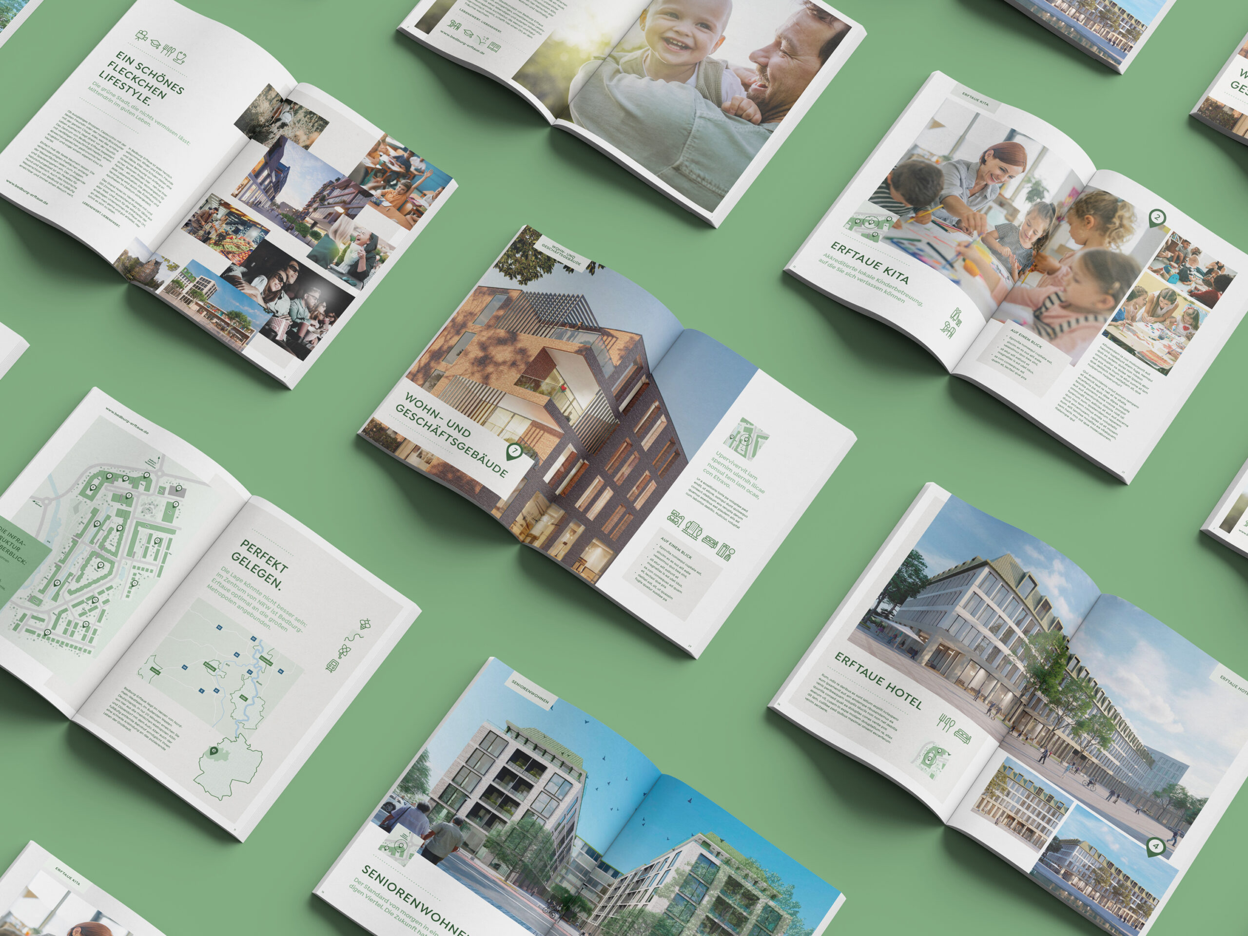
BROCHURES
The property and development industry still loves it’s print products, when people are making a large purchase like a home they always find it reassuring to have a physical brochure to take away and consider at their own pace.