First Rate is the brand name of a joint venture currency exchange service provided by Royal Mail and The Bank Of Ireland. Despite it’s status as a multi-billion pound wholesale business, it’s branding and logo were looking somewhat cursory and dated, and not fitting to a company of this stature. A new logo was needed, something reassuring, competent, modern, but able to stand the test of time. This project was an exercise in exploration, iteration and refinement. Going through hundreds of concepts and variations, and just as many typefaces, until a final version was found.
Rejected Logo Devices
Rejected Logo Explorations
An important consideration in this final logo was that the typography must have a clear differentiator from the logo of First Direct (a key competitor to First Rate with a similar name) while still being a clean sans-serif. This was eventually resolved through the use of the ‘fi’ ligature, lighter weight, and the Matt font’s more human forms and tapered terminals.
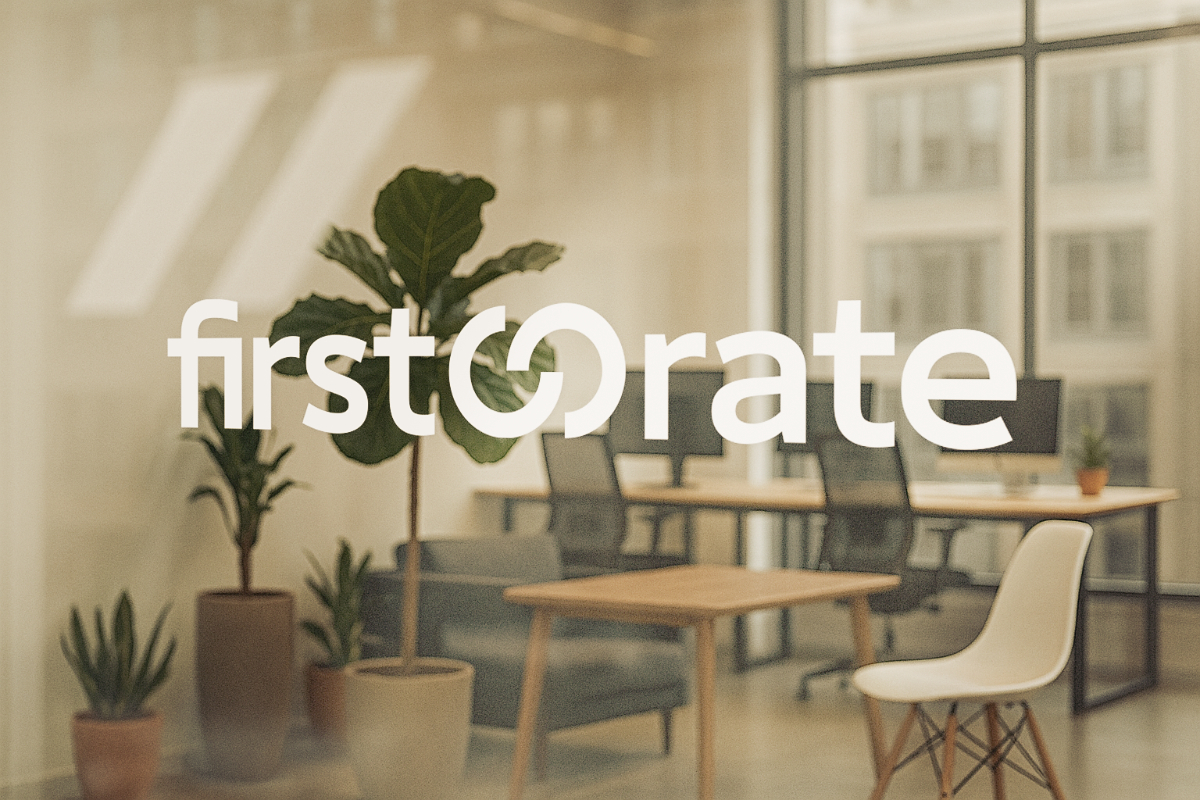
Final Agreed Logo
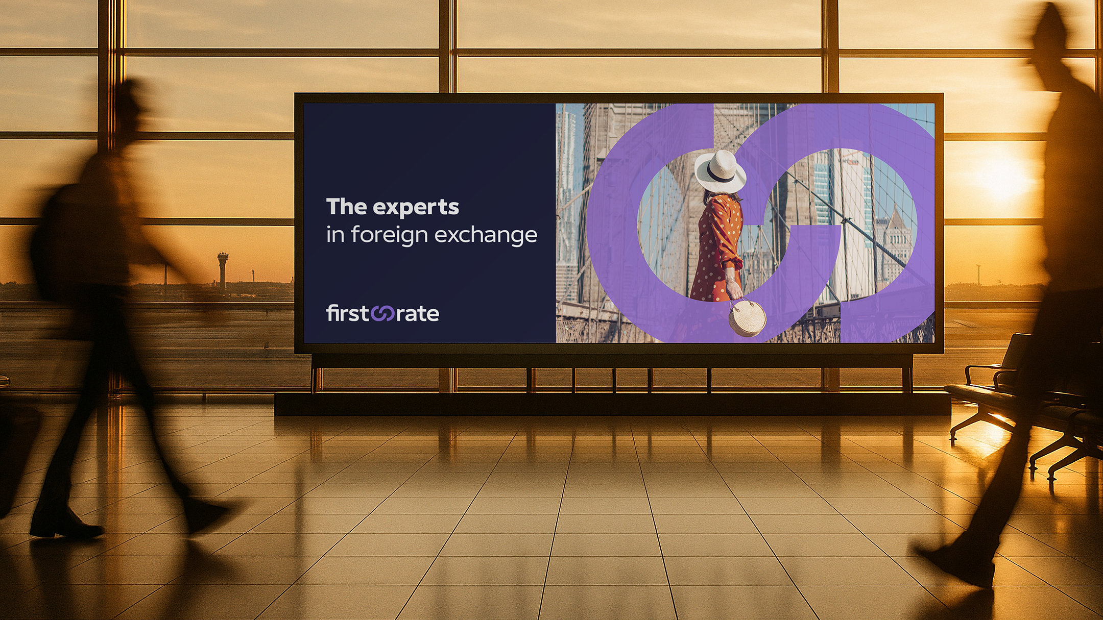
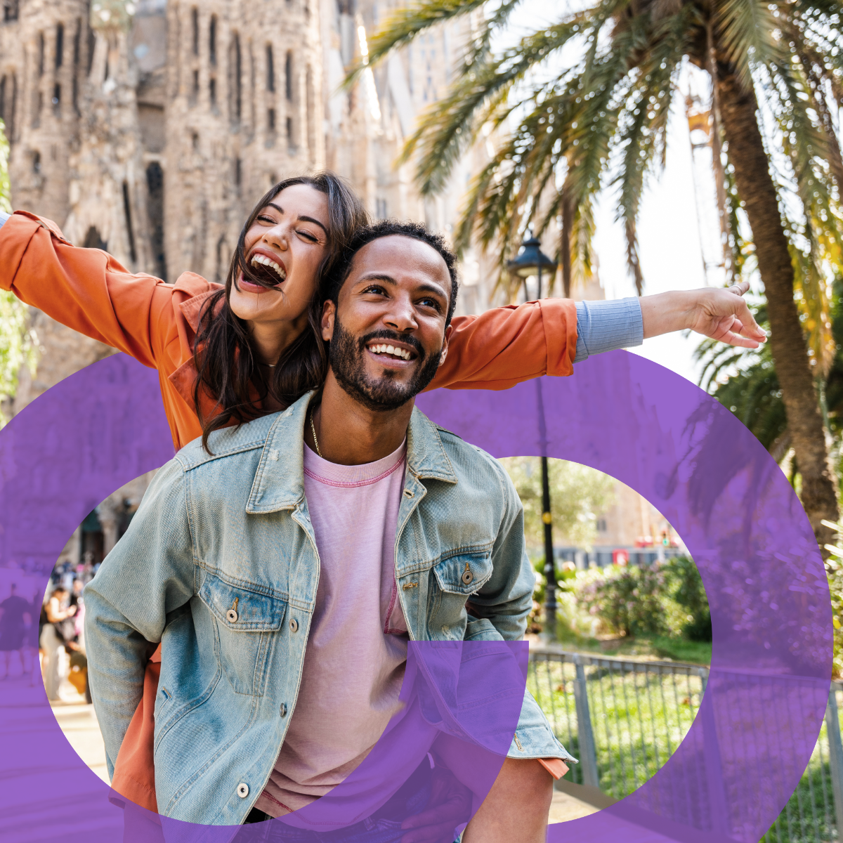
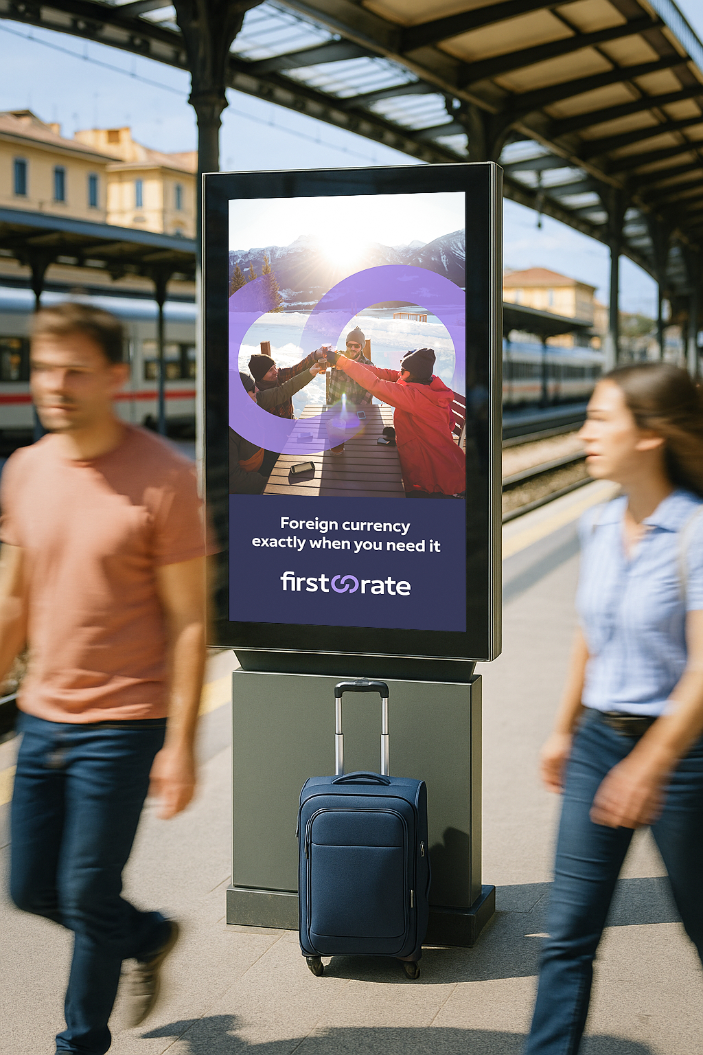
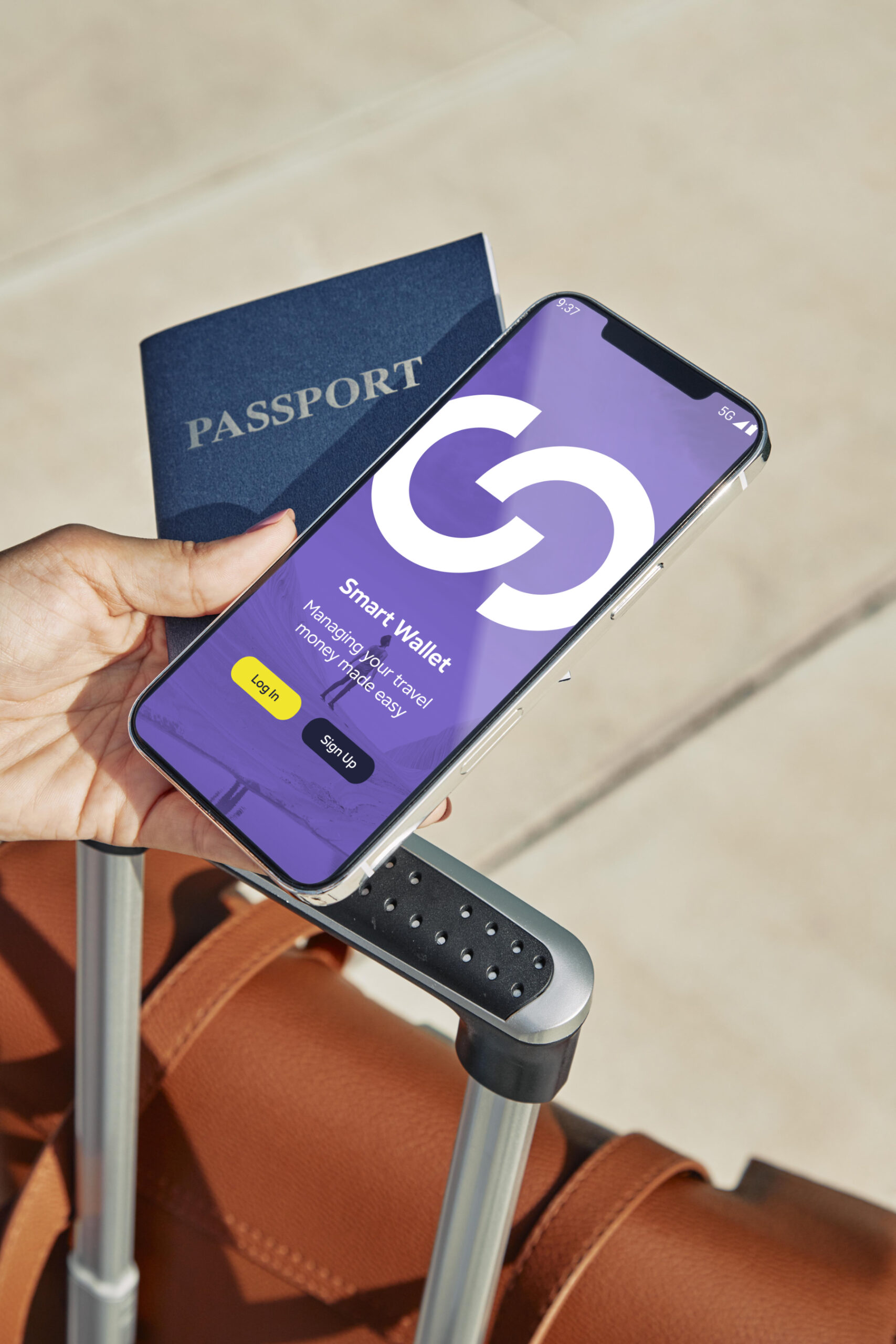
While primarily a B2B business, First Rate intend to begin moving into the B2C space in the near future. With this in mind, the new logo, device, and typography had to be adaptable to OOH advertising and allow them to build a recognisable graphic style with consumers.