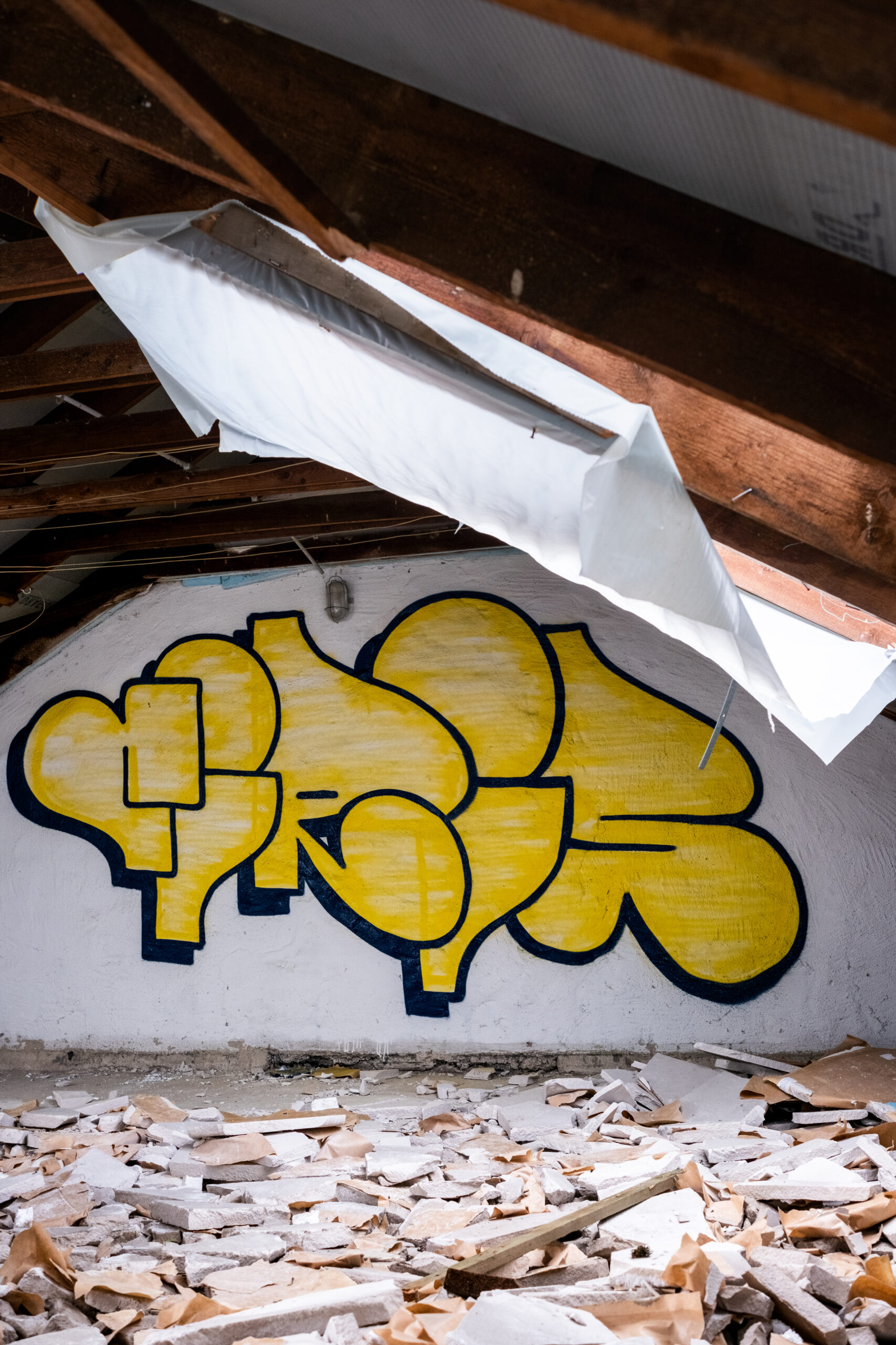
I haven’t really painted many ‘proper’ pieces this year. I think with all the 3D / mecha / experimental stuff last year I’ve naturally come back around to good old throw up letters. I’ve always felt like my throw ups are a bit lacking, so it’s nice to finally dedicate some time to the fundamentals again. Throw ups are everything great about graffiti – not only are they endlessly fun to paint, there’s also a real skill in getting something simple to look dope. Simplicity is the ultimate sophistication, as they say. The outline here still isn’t quite right. The leg on the R doesn’t fit, but it’s a question of whether having that element of disharmony is actually better for the piece as a whole – or is there a better way of doing it that is still quickly and easily reproducible? Likewise, the top of the C is the only place that has that ‘up’ line, everything else is just horizontal. But if I remove that, the C loses some of it’s character. Should the top of the C be the same shape as the R and the S? Technically, probably yes, but it doesn’t quite work then with the left hand side of the letter which needs to stay rounded as it is currently. It’s a puzzle, and every time I paint one I get a little bit closer to the answer.
Leave a Reply